Step 1. 데이터셋 준비하기
import pandas as pd
import numpy as np
import matplotlib.pyplot as plt
import seaborn as sns
Colab Notebook에 Kaggle API 세팅하기
import os# os.environ을 이용하여 Kaggle API Username, Key 세팅하기
os.environ['KAGGLE_USERNAME'] = 'jhighllight'
os.environ['KAGGLE_KEY'] = 'xxxxxxxxxxxxxxxxxxxx'데이터 다운로드 및 압축 해제하기
# Linux 명령어로 Kaggle API를 이용하여 데이터셋 다운로드하기 (!kaggle ~)
# Linux 명령어로 압축 해제하기
!kaggle datasets download -d bobbyscience/league-of-legends-diamond-ranked-games-10-min
!unzip *.zip
Pandas 라이브러리로 csv파일 읽어 들이기
# pd.read_csv()로 csv파일 읽어들이기
df =  pd.read_csv('/content/high_diamond_ranked_10min.csv')

df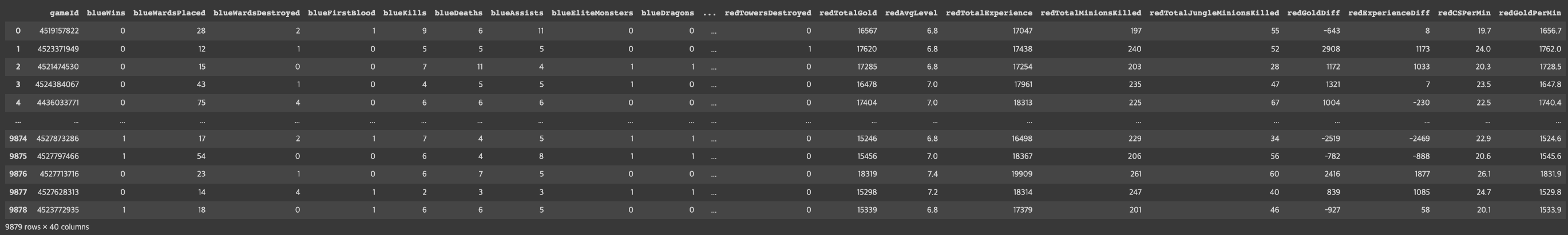
Step 2. EDA 및 데이터 기초 통계 분석
데이터프레임의 각 칼럼 분석하기
# DataFrame에서 제공하는 메소드를 이용하여 컬럼 분석하기 (head(), info(), describe())
df.head()
df.info()
df.describe()
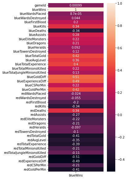
각 칼럼의 Correlation 히트맵으로 시각화하기
# DataFrame의 corr() 메소드와 Seaborn의 heatmap() 메소드를 이용하여 Pearson's correlation 시각화하기
fig = plt.figure(figsize=(4, 10))
sns.heatmap(df.corr()[['blueWins']], annot=True)
<AxesSubplot:>
# DataFrame의 corr() 메소드와 Seaborn의 heatmap() 메소드를 이용하여 Pearson's correlation 시각화하기
df.corr()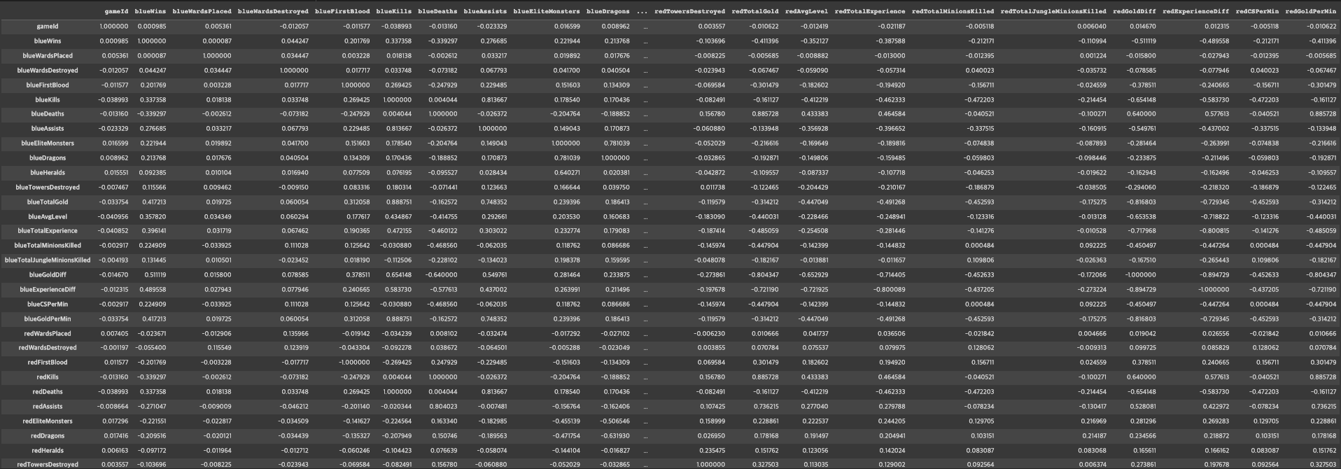
df.columns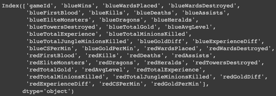
# Seaborn의 countplot() 및 histplot()을 사용하여 각 컬럼과 승/패의 관계를 시각화
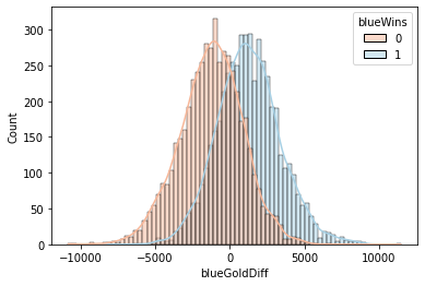
sns.histplot(x='blueGoldDiff', data=df, hue='blueWins', palette='RdBu', kde=True)<AxesSubplot:xlabel='blueGoldDiff', ylabel='Count'>
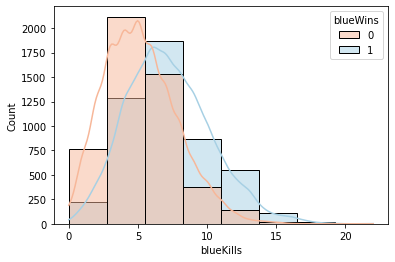
sns.histplot(x='blueKills', data=df, hue='blueWins', palette='RdBu', kde=True, bins=8)<AxesSubplot:xlabel='blueKills', ylabel='Count'>
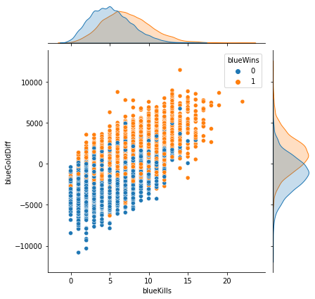
sns.jointplot(x='blueKills', y='blueGoldDiff', data=df, hue='blueWins')<seaborn.axisgrid.JointGrid at 0x7 f1 bbf2 a22 b0>
sns.jointplot(x='blueExperienceDiff', y='blueGoldDiff', data=df, hue='blueWins')<seaborn.axisgrid.JointGrid at 0x7 f1 b87503 b80>

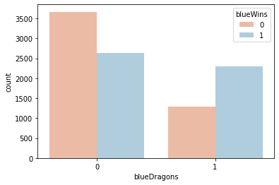
sns.countplot(x='blueDragons', data=df, hue='blueWins', palette='RdBu')<AxesSubplot:xlabel='blueDragons', ylabel='count'>
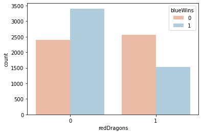
sns.countplot(x='redDragons', data=df, hue='blueWins', palette='RdBu')<AxesSubplot:xlabel='redDragons', ylabel='count'>
sns.countplot(x='blueFirstBlood', data=df, hue='blueWins', palette='RdBu')<AxesSubplot:xlabel='blueFirstBlood', ylabel='count'>

Step 3. 모델 학습을 위한 데이터 전처리
StandardScaler를 이용해 수치형 데이터 표준화하기
from sklearn.preprocessing import StandardScalerdf.columns
df.drop(['gameId', 'redFirstBlood', 'redKills', 'redDeaths',
       'redTotalGold', 'redTotalExperience', 'redGoldDiff',
       'redExperienceDiff'], axis=1, inplace=True)
df.columns
# StandardScaler를 이용해 수치형 데이터를 표준화하기
# Hint) Multicollinearity를 피하기 위해 불필요한 컬럼은 drop한다.

X_num = df[['blueWardsPlaced', 'blueWardsDestroyed',
       'blueKills', 'blueDeaths', 'blueAssists', 'blueEliteMonsters',
       'blueTowersDestroyed', 'blueTotalGold',
       'blueAvgLevel', 'blueTotalExperience', 'blueTotalMinionsKilled',
       'blueTotalJungleMinionsKilled', 'blueGoldDiff', 'blueExperienceDiff',
       'blueCSPerMin', 'blueGoldPerMin', 'redWardsPlaced', 'redWardsDestroyed',
       'redAssists', 'redEliteMonsters', 'redTowersDestroyed', 'redAvgLevel', 'redTotalMinionsKilled',
       'redTotalJungleMinionsKilled', 'redCSPerMin', 'redGoldPerMin']]
X_cat = df[['blueFirstBlood', 'blueDragons', 'blueHeralds', 'redDragons', 'redHeralds']]

scaler = StandardScaler()
scaler.fit(X_num)
X_scaled = scaler.transform(X_num)
X_scaled = pd.DataFrame(X_scaled, index=X_num.index, columns=X_num.columns)

X = pd.concat([X_scaled, X_cat], axis=1)
y = df['blueWins']
X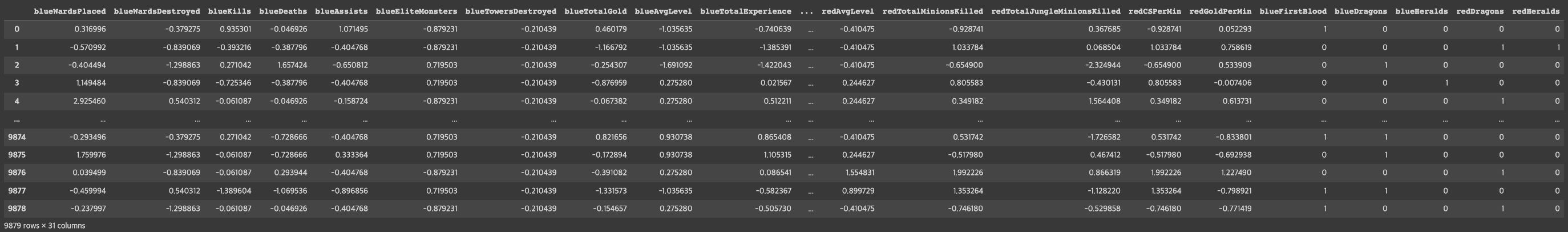
학습데이터와 테스트데이터 분리하기
from sklearn.model_selection import train_test_split# train_test_split() 함수로 학습 데이터와 테스트 데이터 분리하기
X_train, X_test, y_train, y_test = train_test_split(X, y, test_size=0.3, random_state=1)Step 4. Classification 모델 학습하기
Logistic Regression 모델 생성/학습하기
from sklearn.linear_model import LogisticRegression# LogisticRegression 모델 생성/학습
model_lr = LogisticRegression()
model_lr.fit(X_train, y_train)
모델 학습 결과 평가하기
from sklearn.metrics import classification_report# Predict를 수행하고 classification_report() 결과 출력하기
pred = model_lr.predict(X_test)
print(classification_report(y_test, pred))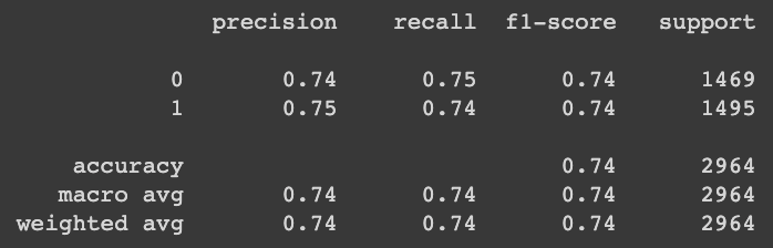
XGBoost 모델 생성/학습하기
from xgboost import XGBClassifier# XGBClassifier 모델 생성/학습
model_xgb = XGBClassifier()
model_xgb.fit(X_train, y_train)
모델 학습 결과 평가하기
# Predict를 수행하고 classification_report() 결과 출력하기
pred = model_xgb.predict(X_test)
print(classification_report(y_test, pred))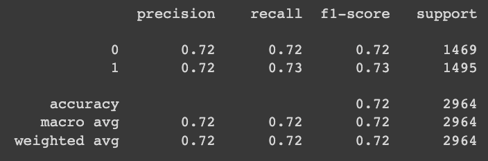
Step5 모델 학습 결과 심화 분석하기
Logistic Regression 모델 계수로 상관성 파악하기
# Logistic Regression 모델의 coef_ 속성을 plot하기
model_coef = pd.DataFrame(data=model_lr.coef_[0], index=X.columns, columns=['Model Coefficient'])
model_coef.sort_values(by='Model Coefficient', ascending=False, inplace=True)
plt.bar(model_coef.index, model_coef['Model Coefficient'])
plt.xticks(rotation=90)
plt.grid()
plt.show()
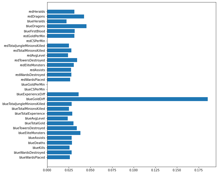
XGBoost 모델로 특징의 중요도 확인하기
# XGBoost 모델의 feature_importances_ 속성을 plot하기
fig = plt.figure(figsize=(10, 10))
plt.barh(X.columns, model_xgb.feature_importances_)
<BarContainer object of 31 artists>
'Python > Kaggle' 카테고리의 다른 글
| Part1. Chapter 05 - 미국의 대통령은 어떻게 뽑힐까 (0) | 2023.03.22 |
|---|---|
| Part1. Chapter 04 - 오늘 밤 유럽 축구, 어디가 이길까_ 데이터로 분석하고 내기르.. (0) | 2023.03.09 |
| Part1. Chapter 02 - 우리 애는 머리는 좋은데, 공부를 안해서 그래요 (2) | 2023.03.07 |
| Part1. Chapter 01 - 데이터 분석으로 심부전증을 예방할 수 있을까 (0) | 2023.03.03 |
| Kaggle 데이터 셋 다운로드 방법 (0) | 2023.03.03 |


